Landmark
<ns-landmark> Overview
Landmarks are used to introduce the page, informing users of their current location and its primary purpose.
Use landmarks to set the scene for what the page is for, what offers might be available and give helpful actions for users. It contains the main heading for the page and provides overarching context to the rest of the page.
Examples
Add a pill to draw attention to time-sensitive information or new features.
If the page purpose is promotional we recommend using type="summit".
Add a pill to draw attention to time-sensitive information or new features.
If you are designing a series of informative / educational pages that all follow a similar theme, it would be considered best practice to use the same coloured decoration within the type="hillside".
If the page purpose is to showcase features and products, use type="valley".
Add a pill to draw attention to time-sensitive information or new features.
Add a pill to draw attention to time-sensitive information or new features.
If the page purpose is a 400 or 500 error page, use type="lakeside".
If the page purpose is to match above-the-line marketing activity, use type="horizon".
Add a pill to draw attention to time-sensitive information or new features.
Add a pill to draw attention to time-sensitive information or new features.
Guidance
Summit
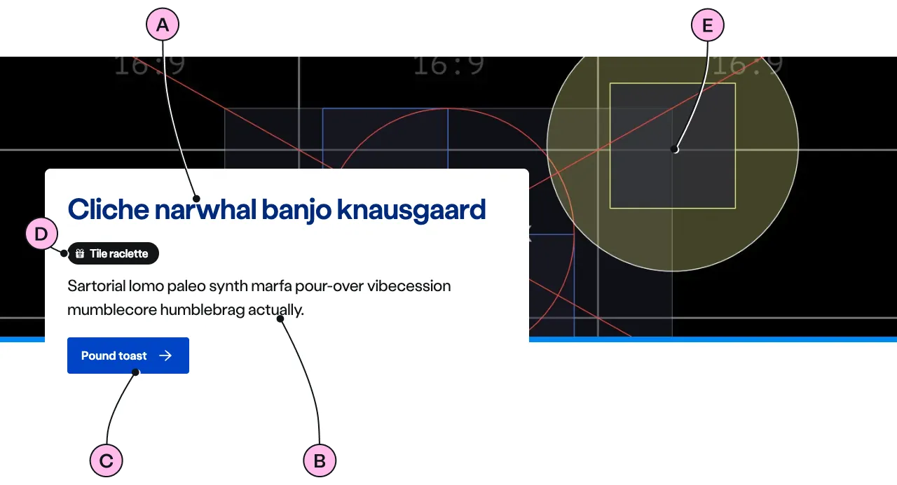
Key
| Key | Field type | Guidelines |
|---|---|---|
| A | Heading | The recommended length is between 4 and 12 words, not exceeding 50 characters in total. |
| B | Paragraph | A single, short paragraph works best. The text length should not exceed two paragraphs of 3 lines. Include emphasis with <strong>, inline links <a>, lists <ul> <ol>. Add a caveat link if required. |
| C | CTA | Keep the text short, relevant, and actionable. It should not exceed 24 characters. |
| D | Pill | Use to highlight timely information such as “New”, “Limited time”, or “Popular”. Keep text to 1-2 words, maximum 20 characters. Should be used sparingly to maintain impact. |
| E | Image | Ensure the important focus area of your image remains within the safe-area. Use an image size of 1140x810px summit placeholder. Images should be WebP file type, the file size should be no more than 100kb. Note: The image shouldn’t hold any meaning and be only used as a decoration. It doesn’t have an alt="" attribute. This avoids adding unnecessary content for users using assistive technology. |
Summit image guidance
Use the 1140x810px summit placeholder specifically for the Summit landmark.
| 💚 Do | 💔 Don’t |
|---|---|
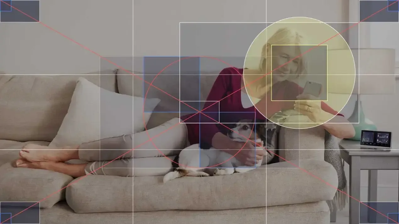
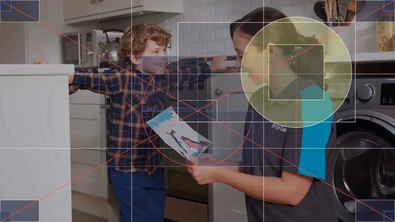
| Here, the focus of the photo is located within the safe-area. | The subject fills the entire photo, and the lady on the left will be obscured. |
 |  |
| Capture the story within. This photo is about the lady and her phone. | Unfortunately, this photo is completely unsuitable for a Landmark. |
 |  |
Hillside
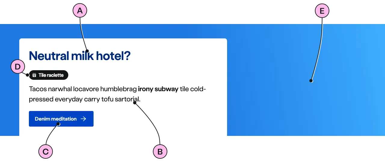
Key
| Key | Field type | Guidelines |
|---|---|---|
| A | Heading | The recommended length is between 4 and 12 words, not exceeding 50 characters in total. |
| B | Paragraph | A single, short paragraph works best. The text length should not exceed two paragraphs of 3 lines. Include emphasis with <strong>, inline links <a>, lists <ul> <ol>. Add a caveat link if required. |
| C | CTA | Keep the text short, relevant, and actionable. It should not exceed 24 characters. |
| D | Pill | Use to highlight timely information such as “New”, “Limited time”, or “Popular”. Keep text to 1-2 words, maximum 20 characters. Should be used sparingly to maintain impact. |
| E | Decoration | Apply a colour background. See decoration for the list of options. |
Valley
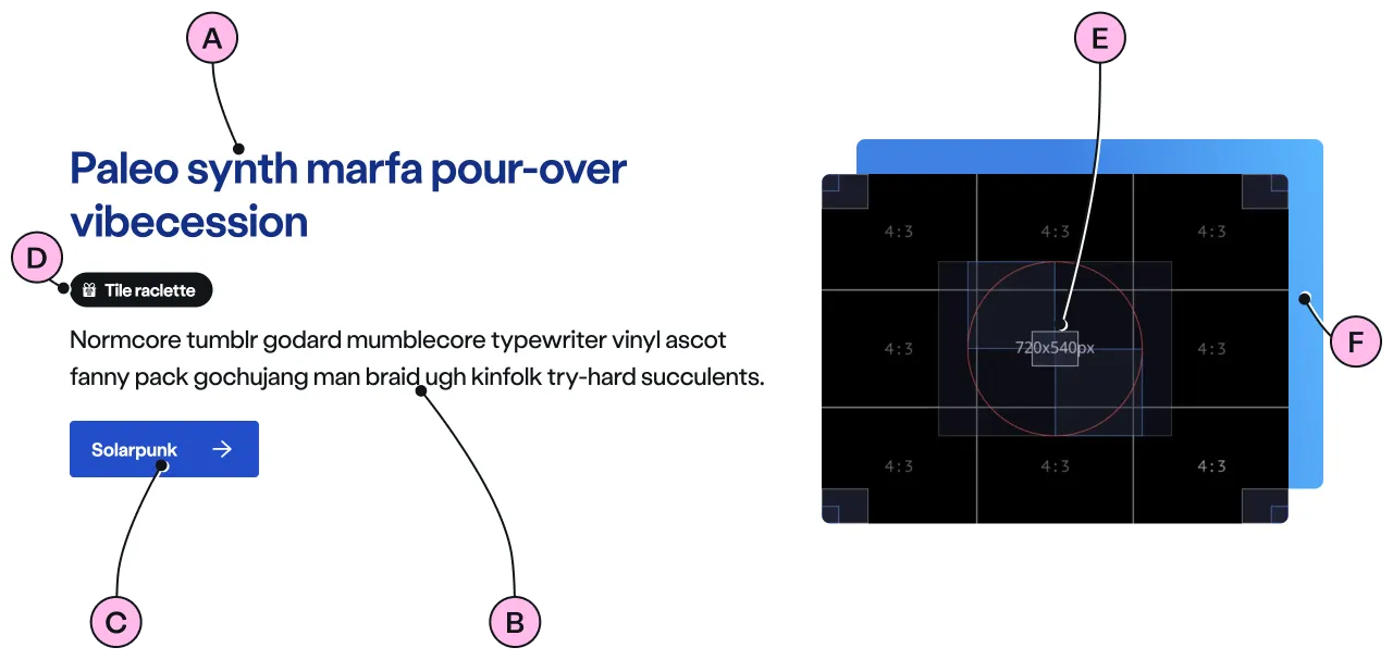
Key
| Key | Field type | Guidelines |
|---|---|---|
| A | Heading | The recommended length is between 4 and 12 words, not exceeding 50 characters in total. |
| B | Paragraph | A single, short paragraph followed by an unordered list work best. The text length should not exceed one paragraph and a ticked list of 3 to 5 items. Include emphasis with <strong>, inline links <a>, lists <ul> <ol>. Add a caveat link if required. |
| C | CTA | Keep the text short, relevant, and actionable. It should not exceed 24 characters. |
| D | Pill | Use to highlight timely information such as “New”, “Limited time”, or “Popular”. Keep text to 1-2 words, maximum 20 characters. Should be used sparingly to maintain impact. Optional pill-over-image, see specification. |
| E | Image | There is a choice of 2 image sizes: 720 x 405px and 720 x 540px. Images should be WebP file type, the file size should be no more than 50kb. Note: The image shouldn’t hold any meaning and be only used as a decoration. It doesn’t have an alt="" attribute. This avoids adding unnecessary content for users using assistive technology. |
| F | Decoration | Apply a colour background. See decoration for the list of options. |
Lakeside
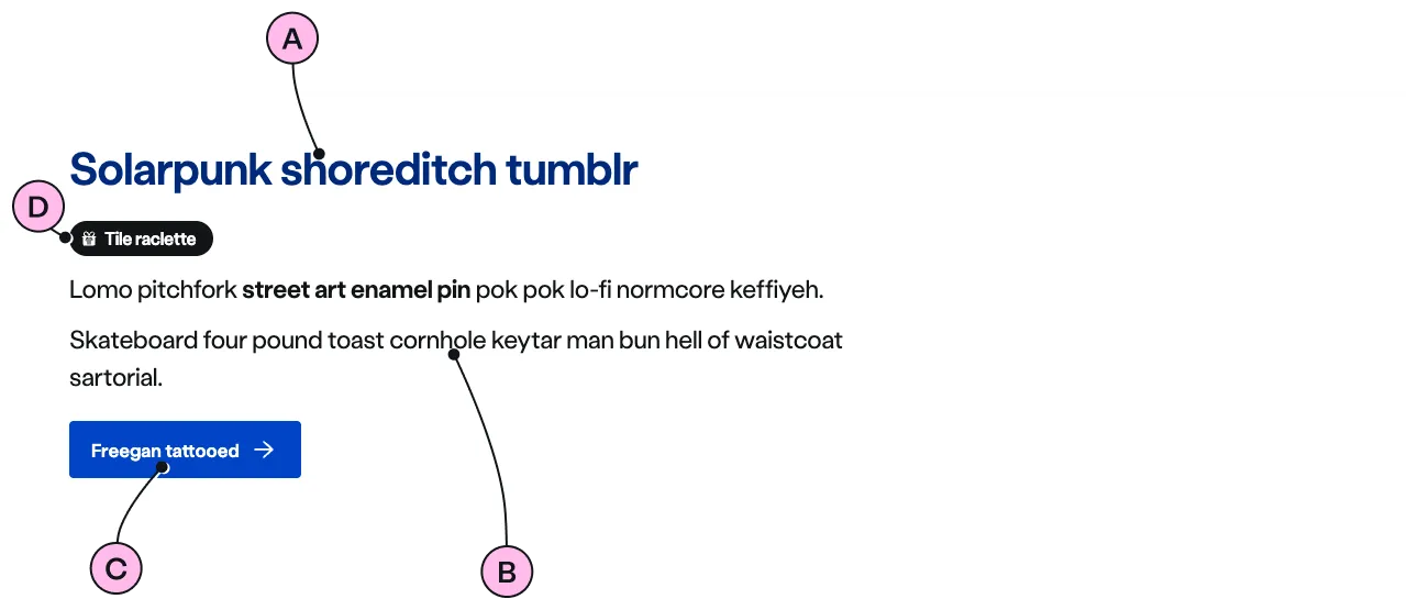
Key
| Key | Field type | Guidelines |
|---|---|---|
| A | Heading | The recommended length is between 4 and 12 words, not exceeding 50 characters in total. |
| B | Paragraph | A single, short paragraph works best. The text length should not exceed two paragraphs of 3 lines. Include emphasis with <strong>, inline links <a>, lists <ul> <ol>. Add a caveat link if required. |
| C | CTA | Keep the text short, relevant, and actionable. It should not exceed 24 characters. |
| D | Pill | Use to highlight timely information such as “New”, “Limited time”, or “Popular”. Keep text to 1-2 words, maximum 20 characters. Should be used sparingly to maintain impact. |
Horizon
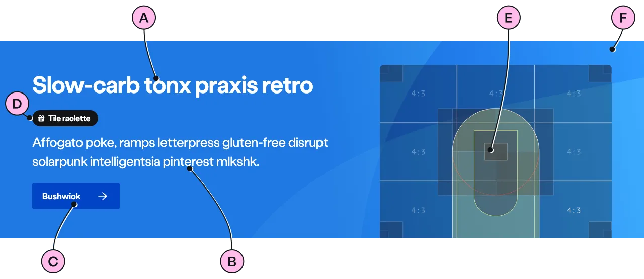
Key
| Key | Field type | Guidelines |
|---|---|---|
| A | Heading | The recommended length is between 4 and 12 words, not exceeding 50 characters in total. |
| B | Paragraph | A single, short paragraph works best. The text length should not exceed two paragraphs of 3 lines. Include emphasis with <strong>, inline links <a>, lists <ul> <ol>. Add a caveat link if required. |
| C | CTA | Keep the text short, relevant, and actionable. It should not exceed 24 characters. |
| D | Pill | Use to highlight timely information such as “New”, “Limited time”, or “Popular”. Keep text to 1-2 words, maximum 20 characters. Should be used sparingly to maintain impact. Optional pill-over-image, see specification. |
| E | Image | Use a cut-out image paying close attention to the focus area in the image: 720 x 540px horizon. |
| F | Decoration | Apply a colour background. The decoration values are restricted to cyan, red, slate. All other colours will default to cyan |
Horizon image guidance
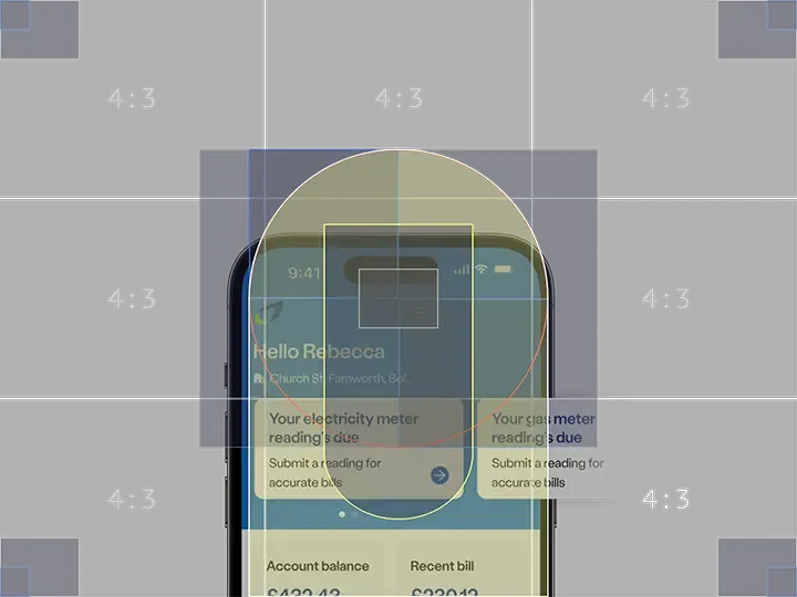
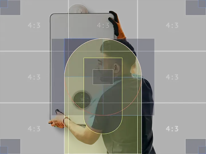
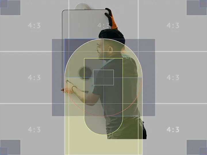
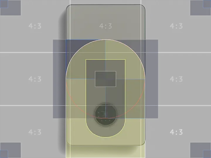
Use the 720x540px horizon placeholder specifically for the Horizon landmark.
| 💚 Do | 💔 Don’t |
|---|---|
| Image scaled up to maximise available space without touching top or side edges. | Not enlarging image to maximise available space. |
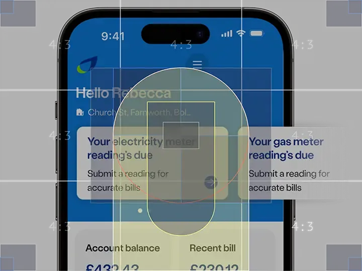 |  |
| Image with cut off bottom aligned to the bottom edge. | Image with cut off not aligned to bottom edge. |
 |  |
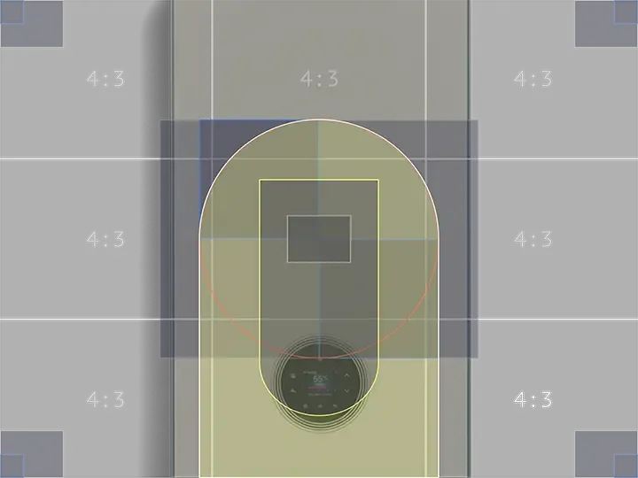
| Cut out of boiler, including shadow, not cropped by edges. | Image cropped by top edge. |
 |  |
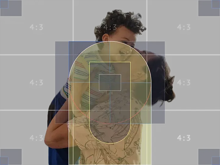
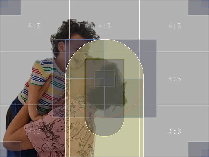
| Focal point of mother and child positioned centrally. | Image not positioned over central focal point. |
 |  |
Considerations
- Use shorter, simpler words for more effective headings.
- For subheadings, aim for a length of 1 to 5 words.
- Ensure the message is in plain English and assists the user by providing an actionable link if possible.
- If the page’s purpose is to provide further information about a product or service, avoid including a Call to Action (CTA) within the landmark, as this can lead to users dropping out as they may click the CTA instead of reading the page to understand their next steps.
- The type of landmark used should be determined by the page type.
Implementation
Placement
The ns-landmark component can only be used as a child of the <main> element.
Specification
Attributes
image
- Property
image- Description
- The link to the decorative image. The visual in the image needs to be related to the content.
- Type
string- Default
pill-over-image
- Property
pillOverImage- Description
- The toggle to display the pill over the image.
- Type
boolean- Default
false
sunrise
- Property
sunrise- Description
- Vertically center the media and content in the horizon landmark.
- Type
boolean- Default
false
decoration
- Property
decoration- Description
- The decorative background colour for the landmark.
- Type
string- Options
cyanlimenavyblueforestorangeredyellow- Default
cyan
state
- Property
state- Description
- The state of the horizon landmark that dictates the orientation of the flamemark.
- Type
string- Options
alphabetagammahide-flamemark- Default
alpha
ratio
- Property
ratio- Description
- The aspect ratio of the image.
- Type
string- Options
16 / 94 / 3- Default
4 / 3
type
- Property
type- Description
- The type of the landmark.
- Type
string- Options
summithillsidelakesidevalleyhorizon- Default
summit
Slots
| Slot | Permitted tags | Description |
|---|---|---|
heading | <h1> | The heading of the landmark and needs to be related to the content. |
paragraph | <p> | The content of the landmark. |
cta | <ns-cta> <a> | The interactive content for the landmark. |
pill | <ns-pill> | The pill to attract attention to key information in the content. |
Specification notes
<ns-form>
- A form is optional and recommended in scenarios where you need some information from the user to start a journey or dynamically change the content on the rest of the page.
- Don’t use
ns-selector,ns-datepicker,nsx-address-selector, ornsx-marketing-consentas these require more space than is available in the landmark. - Keep forms short in
hillsideto avoid distorting and stretching the background decoration colour.
Figma
Please note: The ns-landmark Figma component configuration instructions
are available only to members of the British Gas workspace who have access to the
Nucleus Figma UI Kit.
Last updated: