Standout
<ns-standout> Overview
To visually draw attention to content.
✨ This is an auto-generated AI summary of the ns-standout's documentation. It may not be accurate. ✨
Use the ns-standout component to make information stand out from a page and to visually differentiate a concise block of text from the content that surrounds it, for example:
- Quotes (as in prices)
- Call-outs
- Examples
- Additional information about the page
- Emergency information
Examples
Guidance
Standard

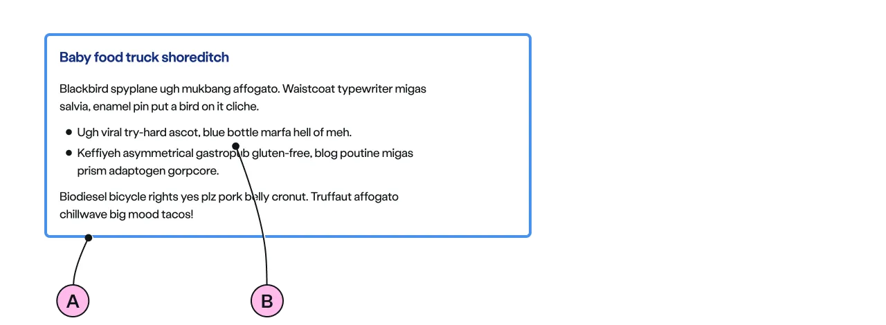
Key
| Key | Field type | Guidelines |
|---|---|---|
| A | Decoration | The colour of the border. See decoration for the list of options. |
| B | Anonymous slot | Introduce content with a heading. Add a few short paragraphs. Include emphasis with <strong>, inline links <a>, lists <ul> <ol>. Add a caveat link if required. |
Implementation
Placement
The ns-standout component can be used in the following components:
Specification
Attributes
decoration
- Property
decoration- Description
- The decorative border colour or scheme, to draw attention to the content of the standout.
- Type
string- Options
cyanlimenavyblueforestmembershipslateorangeredyellow- Default
cyan
type
- Property
type- Description
- The emphasis of the standout. Subtle shows a coloured border, strong applies a full colour scheme.
- Type
string- Options
subtlestrong- Default
subtle
Slots
| Slot | Permitted tags | Description |
|---|---|---|
| Anonymous slot | <ns-content> <ns-column> | The anonymous slot for the content. |
Specification notes
membership decoration is used to highlight membership related information, such as exclusive offers or benefits for members.
Figma
Please note: The ns-standout Figma component configuration instructions
are available only to members of the British Gas workspace who have access to the
Nucleus Figma UI Kit.
(Opens in Figma).
Last updated: