Panel
<ns-panel> 
Overview
Panel is a decorative empty container that holds each section of a page.
✨ This is an auto-generated AI summary of the ns-panel's documentation. It may not be accurate. ✨
It provides an area to place a layout, add an optional decoration and apply the appropriate margins. There can be more than one ns-panel on a page.
Examples
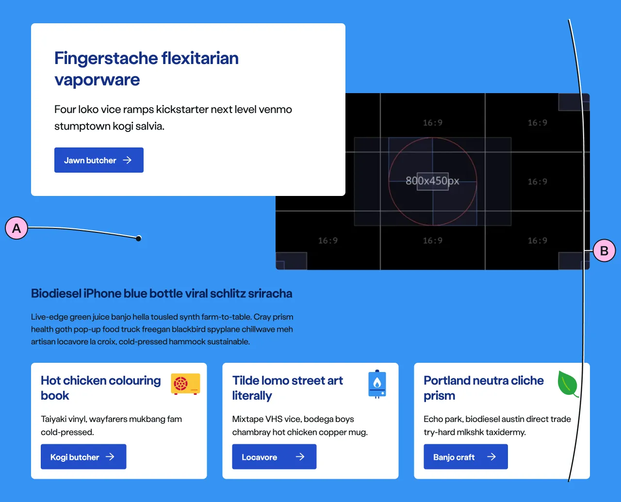
The standard panel, goes from the browser’s edge to edge
To break the page’s rhythm and flow, the inset panel is contained and has margins on each side.
Guidance
Standard
Inset
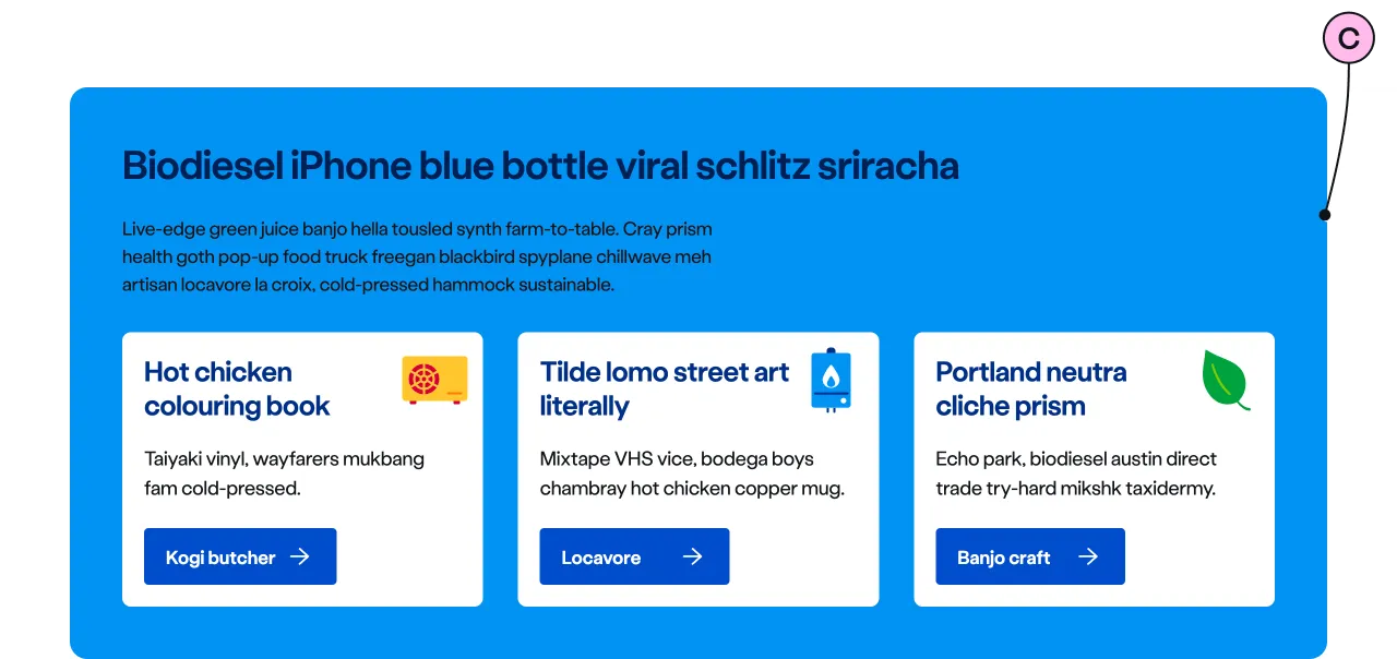
Key
| Key | Field type | Guidelines |
|---|---|---|
| A | Decoration | Choose between a no-colour background (default) or one of the decoration options. |
| B | Anonymous slot | Items placed in the anonymous slot can include a variety of different types of content and components. |
| C | Inset | The inset attribute gives the panel a container that is not going edge to edge, for this reason, be mindful of the size and type of content that goes in this kind of panel, specially at smaller viewport sizes. |
Implementation
Placement
The ns-panel component can be used in the following components:
<main><ns-tabs>
Specification
Attributes
decoration
- Property
decoration- Description
- The decorative background colour of the panel with optional top and bottom offset percentages.
- Type
string- Options
cyancyan-lightlimelime-lightnavynavy-lightblueforestforest-lightorangeorange-lightredyellowyellow-lightwhitegrey-light- Default
inset
- Property
inset- Description
- The toggle to display the inset decoration.
- Type
boolean- Default
false
type
- Property
type- Type
string- Default
panel
Slots
| Slot | Permitted tags | Description |
|---|---|---|
| Anonymous slot | <div> <ns-column> <ns-content> <ns-lockup> | The anonymous slot for content. |
Figma
Please note: The ns-panel Figma component configuration instructions
are available only to members of the British Gas workspace who have access to the
Nucleus Figma UI Kit.
(Opens in Figma).
Last updated: